After almost three years of starting our business, we thought we might need some professional help to get our branding the right look. So we asked our friend Monika Gehle to rework our CI.
The new brand image:
French sense of style paired with German accuracy,
the qualities that define me as a person, me as a designer and the orientation of my brand.
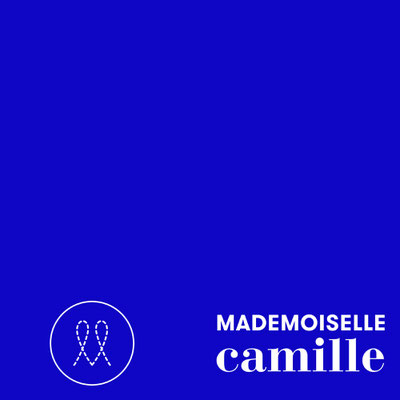
The new signet, the two Ls
embroidered as a reminder of the textile craftsmanship that forms the basis of my skills.
The new logo, two fonts
one stands for the refinement and elegance of my handwriting, the other for the reliability, the know-how and the accuracy of the
execution of my projects.
The new guiding principle brings the core of my work to the point.
The design of patterns, which are then printed on different substrates to create feel-good spaces.
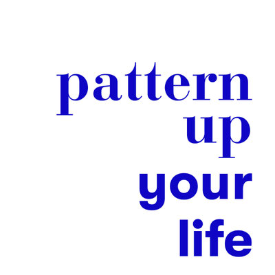
The new claim "PATTERN UP YOUR LIFE" embodies my brand message.
Be courageous and bring colour and pattern into your life.
The new color, a deep, cheerful, BLUE,
as the colour I associate with myself, but which has always played an important role in the history of colour. It stands for expanse, for longing, for openness, like the sky that surrounds us.
This is what I want to achieve with my patterns.