
Ein Beispiel für eine wunderbar gelungene Zusammenarbeit und ein gutes Besipiel, für die BESONDERHEIT meiner Arbeit
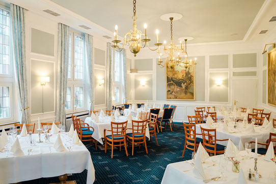
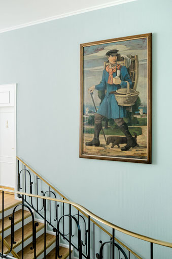
Nikola Bacher von NIKOGWENDO durfte diesen wunderbaren Raum im ersten Geschoss des Gasthauses Großer Kiepenkerl mitten in der Altstadt von Münster auffrischen. Mit neuer Wandfarbe und passenden Vorhängen bekamm der Raum mit wenigen Mitteln einen komplett neuen Look.
An example of a wonderfully successful collaboration and a good example, for the SPECIALITY of my work.
Nikola Bacher from NIKOGWENDO was allowed to freshen up this wonderful room on the first floor of the Gasthaus großer Kiepenkerl in the middle of the old town
of Münster. With new wall paint and matching curtains, the room got a completely new look with just a few items.
Konzept
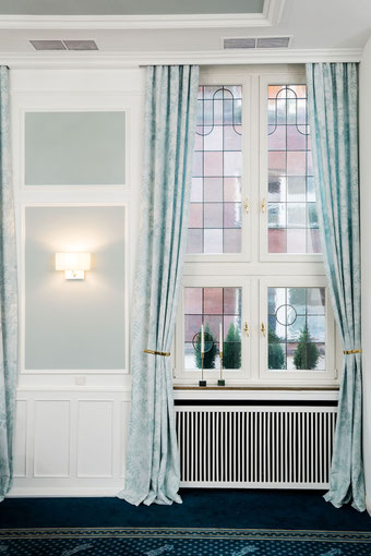
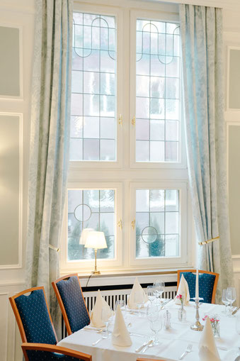
Die Idee war mit wenigen Mitteln und ohne das komplette Interieur auszutauschen, dem Raum einen neuen Look zu verpassen. Und so war das Konzept von Nikola Bacher, den Raum in eine neue Farbwelt zu tauchen: leichte blau-grüne Wasser Töne, die wunderbar mit den Schattierungen der Fenstegläser des Raumes harmonieren.
Hauptton für die Wände: eine leichte gräuliche blau-grüne Kreide Farbe aus der Kollektion von Anna von Mangoldt.
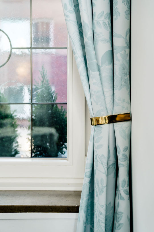
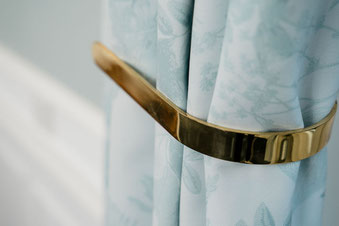
Details, die bereits vorhandenen Messing Accesoires: Vorhangraffer, Fenstergriffe, Handlauf am Treppengeländer...
Und vielleicht das Highlight, leichte Vorhänge mit meinem Muster OMBRES CHINOISES in Tönen passend zur Wandfarbe.
Das Kolorit der Vorhänge wurde auf das Konzept der Interior Designerin abgestimmt und so exclusive für das Restaurant gefertig.
Concept
The idea was to give the room a new look with few means and without replacing the entire interior. And so Nikola Bacher's concept was to immerse the room in a new world of colors: light
blue-green water tones that harmonize beautifully with the shades of the room's fenestration glass.
Main tone for the walls: a light grayish blue-green chalk paint from Anna von Mangoldt's collection.
Details, the already existing brass accessories: curtain raisers, window handles, handrail on the staircase railing....
And perhaps the highlight, lightweight curtains with my pattern OMBRES CHINOISES in tones matching the wall color.
The color of the curtains was matched to the concept of the interior designer and so made exclusively for the restaurant.
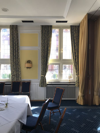
Vorher
Ein kurzer Blick auf ein "VORHER" Foto zeigt, das mit wenigen Mittel viel verändert wurde!
Die Hauptfarben waren gelb und blau Töne, gepaart mit schweren Vorhängen und vielen Kassetten an Wand und Decke.
Teppich, Stühle und Tische und die Kunst an den Wänden wurden beibehalten, Vorhänge Wandfarbe und Lampen wurden erneuert und schon wirkt der Raum komplett verändert!
Before
A quick look at a "BEFORE" photo shows that a lot was changed with few items!
The main colors were yellow and blue tones, paired with heavy curtains and lots of coffers on the walls and ceiling.
Carpet, chairs and tables and the art on the walls were kept, curtains wall color and lamps were renewed and already the room looks completely changed!
Are you interested in these kind of projects, do you need custommized fabric or wallpaper?
Photos: Benni Janzen
Kommentar schreiben